Wednesday, February 24, 2010

MODULE 6 CHOROPLETH MAPS

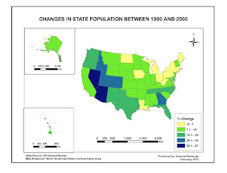
MAP 1. Percentage Population Change by State

I am still struggling with layers, but things are improving. I learnt how to proportionally constrain the size of a layer (other than by manual eyeballing), which is a useful skill. I had a few problems importing from ArcGIS, especially with regard to font and size. I think perhaps ArcGIS saves in an older version of AI. I had to redo some of the text in AI. Still a bit frustrating to work with AI, but I am beginning to see potential here.
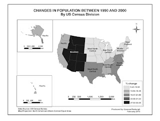

MAP 2. Percentage Population Change by Division

I wanted to make the divisions visually clearer and non-ambiguous but I could not figure out how to overlay pattern upon colour or how to outline a division with a darker colour. But I don't think it is that important to know exactly which state is in which division so the slight ambiguity should not be a problem. Nevertheless it would be good to find this out in future.
Sunday, February 14, 2010

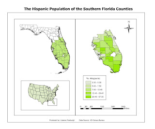
MODULE 5 MAP COMPOSITION

Uff. I sweated over this map. It took forever to figure out how to work with layers, and be able to move map elements around and resize them. Still lots to learn about using Illustrator. I had a lot of trouble with the colours and even though the possibilities are endless and it was fun playing with the colour wheel, in some ways I prefer this in Arc where you have a limited selection of options that work. The colours in this map need more work, but I have reached my time limit ...........

Monday, February 8, 2010

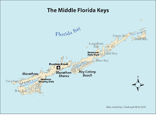
MODULE 4 TYPOGRAPHY

Our assignment this week was to correctly label a map of the central Florida Keys. This was also our first introduction to Abode Illustrator. AI looks like it is going to be great to work with, once we have figured it out.


I enjoyed using the Bauhaus font to label the National Park and City features, and I looked it up in Wikipedia. This font was based on Herbert Bayer's 1925 experimental Universal typeface. Who was Herbert Bayer? He was an Austrian graphic designer and artist and the last surviving member of Bauhaus. He died in 1985. He studied under Wassily Kandisky, and eventually ended up living in Aspen, Colorado. The Denver Art Museum apparently contains a large number of his works.

Tuesday, February 2, 2010

MODULE 3 DATA CLASSIFICATION

Our assignment for this week was to map the percentage of African Americans living in different parts of Escambia County, Florida, using different data classification methods, and to assess which classification method best represents the data.


Which classification best represents the data and why?

The data are positively skewed. Thus using the Equal Interval classification is not ideal, as most counties fall into the first two classes, with the last class having very few counties.

The distribution of data across Natural Break classes is also clumped, again with the first two classes containing most of the data. This would be the method of classification that I would probably avoid in general as it is not easily interpretable and is difficult to compare between maps.

Both Standard Deviation and Quantile classifications produce a more even distribution of data as there are approximately equal number of counties in each class. However, as the data are positively skewed, and thus not normally distributed, the Standard Deviation method would be best used if the data were normalized first.

I would thus choose the Quantile method as the best method of representation for this data set.