Monday, October 25, 2010
Project 3. Week 2. Market Analysis and Site Selection
The two maps above show a comparison of two market area models: Percentage of Sales and Drive Time. The map below shows sites which are suitable for the location of a new Better Books Store. I selected Steiner as the model store against which to assess the 3 potential sites.
Monday, October 18, 2010
Monday, October 11, 2010
Saturday, October 2, 2010
Project 2. Analyze. Carbon storage and sequestration in urban trees
Monday, September 27, 2010
Project 2. Prepare. Trees in Urban Landscapes.
Hopefully this project will go smoother than the last one! This is a topic close to my heart. Malawi (or the city of Lilongwe where I live) is losing trees rapidly, both to development and for fuelwood, and people have little understanding of the value of standing live trees, and no incentive not to cut them down.
Still having a bit of trouble figuring out how to adjust text and lines in ArcMap to show up well on map images.
Monday, September 20, 2010
Project 1. REPORT
Unfortunately I ran out of time to complete all the maps. This was a somewhat frustrating week as the goalposts shifted in terms of deliverables. However, I guess that happens with deliverables in the real world too. Hopefully the coming projects will go more smoothly as we now have a better understanding of how this module will work.
Wednesday, September 15, 2010
Tuesday, September 7, 2010
SAN FRANSCISCO BAY AREA.
Links to Metadata
1. Asthma
2. Ozone
3. Particulate Matter
4. Race
Friday, July 23, 2010
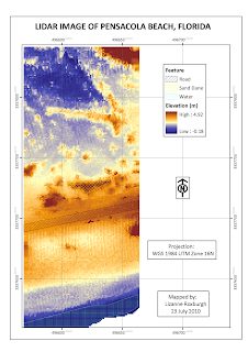
MODULE 5. LIDAR
Tuesday, July 20, 2010
MODULE 4. Supervised Classification
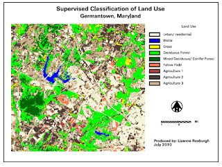
After completing the supervised classification, I combined several classes to simplify the legend. I combined only two of the 4 agriculture classes as they had relatively different spectral signatures, but combined all the urban signatures as well as the fallow fields. Some of the roads seem to have been classified as agricultural land or fallow fields.
Link to xps file
Wednesday, July 14, 2010
MODULE 3. Rectification
Link to map in xps format
Saturday, June 26, 2010
MODULE 1. Introduction to Erdas
This was a straightforward lab. It seems that the map-making capabilities of Erdas Imagine are limited. I assume its strength lies elsewhere.
I tried to save the map as a pdf, but that caused Imagine to hang and I had to shut it down.
Tuesday, April 27, 2010
FINAL PROJECT
Tuesday, April 6, 2010
MODULE 11 GOOGLE EARTH
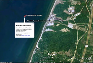
A close up of the site, with the annotated placemark:
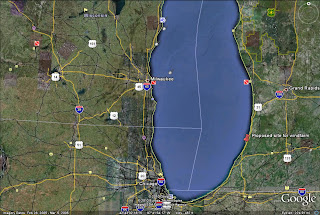
Most onshore sites in the Great Lakes Region have wind speeds that are too low or marginal for wind power generation. Two regions that were most suitable based on wind speed data from the Wind Energy Resource Atlas were the Keenawah Peninsula, Isle Royale and offshore areas in Lake Superior and the eastern shores of Lake Michigan. These both had annual average wind power of at least 5. The Lake Superior site was too isolated and too far from where power was needed, in addition to which
a) wind turbine installations require power input for when the wind is not blowing and thus need to have access to a external power supply
b) Isle Royale is a National Park, and there are several other parks and forest reserves in the area, making a turbine installation undesirable from a landscape and visual impact perspective.
I thus chose an offshore site along the eastern shores of Lake Michigan as this has wind speeds sufficiently high for wind power generation all year round. The wind direction here is north-west to south-west. I chose a site close to a nuclear power station, as the power station could easily and cheaply supply the additional power needed by the turbines when they are not generating their own power. This has been done before in another nuclear power station in the US, and in fact, the turbines could be placed immediately around the power station onshore as an alternative site.
In terms of the other assessment criteria:
a) Ornithology. There could be a conflict with migration flyways, in particular the Mackenzie Valley-Great Lakes-Mississippi Valley Route, but this would need to be carefully assessed at a local scale to find out exact migration paths and heights.
b) Noise: a 300 m or more distance is required to reduce the noise to less than 35-40 dBa. The installation will be approximately 2 kms offshore.
c) Shadow flicker: a distance of 10 shadow diameters (400 to 800 m) is required to prevent shadow flicker. The installation is placed 2 kms offshore, so this will not be a problem.
d) Shipping: There is no conflict here with shipping lines. The main shipping lines are on the western side of Lake Michigan
e) Landscape and Visual Impact: A limit of at least 8 kms and up to 13 is recommended to minimize visual impact. The turbine installation would be approximately 8 kms from the nearest town, which is South Haven, so the visual impact will be minimal for the town. However, there are two parks in the vicinity of the nuclear power plant: Van Buren State Park to the North East and Covert Township Park to the south East. Possibly the parks were set up to create a buffer zone around the nuclear power plant, but the installation will have some visual impact on these two parks. The costs of placing the installation further offshore need to be assessed relative to the negative visual impacts. In addition, there are presumably building restrictions for the nuclear power plant, which will keep homes and other structures distant from the turbines, and the nuclear power plant itself already has visual impact in the area.
Monday, March 29, 2010
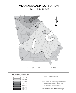
MODULE 10 ISARITHMIC MAPPING
Sunday, March 21, 2010
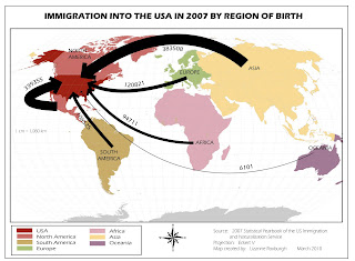
MODULE 9 FLOW MAPS
Sunday, March 14, 2010
MODULE 8 DOT MAPS
Monday, March 1, 2010
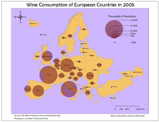
MODULE 7 PROPORTIONAL SYMBOL MAPS
Wednesday, February 24, 2010
MODULE 6 CHOROPLETH MAPS
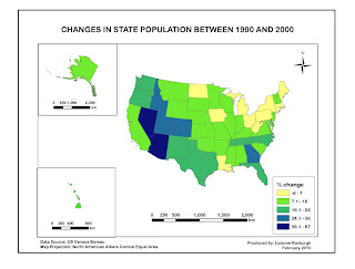
I am still struggling with layers, but things are improving. I learnt how to proportionally constrain the size of a layer (other than by manual eyeballing), which is a useful skill. I had a few problems importing from ArcGIS, especially with regard to font and size. I think perhaps ArcGIS saves in an older version of AI. I had to redo some of the text in AI. Still a bit frustrating to work with AI, but I am beginning to see potential here.
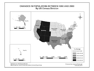
I wanted to make the divisions visually clearer and non-ambiguous but I could not figure out how to overlay pattern upon colour or how to outline a division with a darker colour. But I don't think it is that important to know exactly which state is in which division so the slight ambiguity should not be a problem. Nevertheless it would be good to find this out in future.
Sunday, February 14, 2010
MODULE 5 MAP COMPOSITION
Monday, February 8, 2010
MODULE 4 TYPOGRAPHY
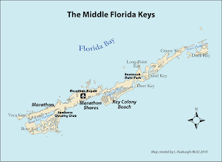 I enjoyed using the Bauhaus font to label the National Park and City features, and I looked it up in Wikipedia. This font was based on Herbert Bayer's 1925 experimental Universal typeface. Who was Herbert Bayer? He was an Austrian graphic designer and artist and the last surviving member of Bauhaus. He died in 1985. He studied under Wassily Kandisky, and eventually ended up living in Aspen, Colorado. The Denver Art Museum apparently contains a large number of his works.
Tuesday, February 2, 2010
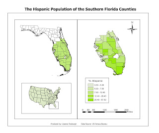
MODULE 3 DATA CLASSIFICATION

Which classification best represents the data and why?
The data are positively skewed. Thus using the Equal Interval classification is not ideal, as most counties fall into the first two classes, with the last class having very few counties.
The distribution of data across Natural Break classes is also clumped, again with the first two classes containing most of the data. This would be the method of classification that I would probably avoid in general as it is not easily interpretable and is difficult to compare between maps.
Both Standard Deviation and Quantile classifications produce a more even distribution of data as there are approximately equal number of counties in each class. However, as the data are positively skewed, and thus not normally distributed, the Standard Deviation method would be best used if the data were normalized first.
I would thus choose the Quantile method as the best method of representation for this data set.

Sunday, January 17, 2010
MAP CRITIQUE
Airbus Crashes in New York River – 16 January 2009
It’s the one-year anniversary of this crash. This was an emotive story, especially for those who fly regularly and have in the backs of their minds the fear of a crash - the difference with this crash being that all passengers and crew survived. How did the news media deal with this in terms of displaying the flight route and crash site?
I found the following two maps, one taken from the BBC News website and the other taken from the Huffington Post website. I know it may be unfair to compare a map placed on a website by one of the largest global media corporations with that of a small local paper. But I think this example illustrates how, with a bit of effort, a very bad map can be turned into a good one.
BBC News Map
Link to the story and map:
http://news.bbc.co.uk/2/hi/americas/7833025.stm
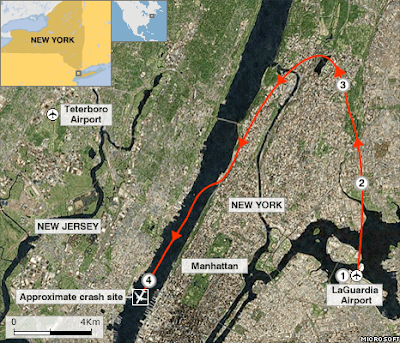
1 1526 local time (2026 GMT): Flight 1549 takes off from New York's LaGuardia Airport
2 1527 (2027 GMT): Pilot Chesley Sullenberger III reports birds hitting both engines and says he is returning to LaGuardia
3 1528 (2028 GMT): Plane banks to the left, but pilot decides he cannot reach LaGuardia or nearby Teterboro airport
4 1531 (2031 GMT): Pilot ditches plane in Hudson River
Good points about the map: the information is presented simply and clearly over the satellite image of the site, with the map placed in its geographical context in North America.
However, I assume that any cartographer looking at a map would have their own ideas of how to change or improve a map. In this map, I would include on the map itself some text about what happened at points 2 and 3.
Would the flight route have been better placed over a map of New York rather than a satellite image? I think the good thing about using imagery is that it is like a photograph and that a lot of what is displayed is understood intuitively, and does not require explanation. What strikes me about the image is that there is so little open space which could have been used to put that plane down safely. I don't think that would have come across as well using a map.
Huffington Post Map
Link to the story and map:
http://www.huffingtonpost.com/2009/01/15/hudson-river-plane-crash_n_158300.html
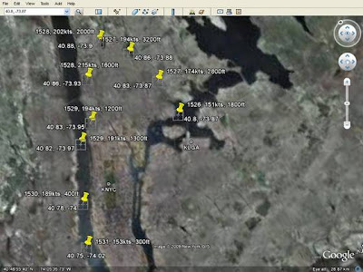
Why is it bad? In summary, lack of information and lack of summarizing what information was there for ease of comprehension by the viewer.
The image was not placed in a geographical context, so anyone not familiar with New York would have no idea where the crash happened.
No effort was made to indicate the direction of the flight, so that the viewer has to spend a few minutes working it out for themselves.
Joining the dots, or the place marks in this case, would have helped to show the flight rout more clearly.
KLGA and KNYC are incomprehensible labels for most people.
The cartographer (I use the term loosely here) did not bother to do more than a screen dump, and did not even make the effort to create a graphics file of the map alone.
The quality of the imagery used is very poor.
The GPS co-ordinates and altitude are surely of little or no interest to the general viewer and would constitute map crap, if there was anything else on the map.
HAITI EARTHQUAKE
Here's an interactive map, based on a satellite image, that shows the extent of damage in Port-au-Prince:
http://news.bbc.co.uk/2/hi/americas/8460787.stm


